
 ?
?
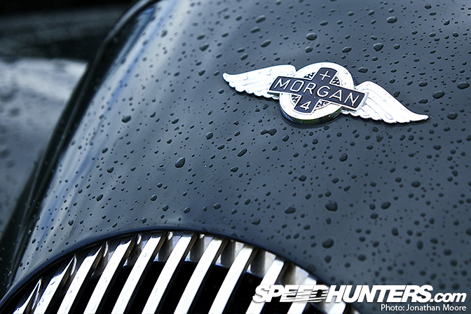
As I'd arrived on site for the second day at the Goodwood Revival I'd been greeted by a blustery wind and light rain falling from the grey, cloud-laced sky. As I reluctantly put rain covers on the cameras and trudged away from my car, parked right at the far end of one of the car parks, I decided to head for a line of Morgans that I'd spotted as I was driving in. Leaning in close to get good look, I not only realised how nice the cars looked with the rain drops, but also the sheer diversity and beauty of all the car badges on show.
?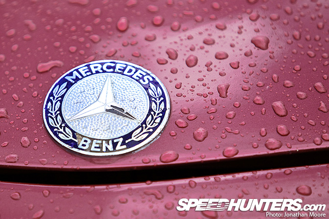
I don't think it's chance that car manufacturers are looking back to the designs of their golden eras. For instance, a variation on the elongated 1901 FIAT typographic logo is back in common usage, and Mercedes now affix old-style roundels to their models. But at Goodwood you get the chance to see the originals – and in some quantity and quality.
?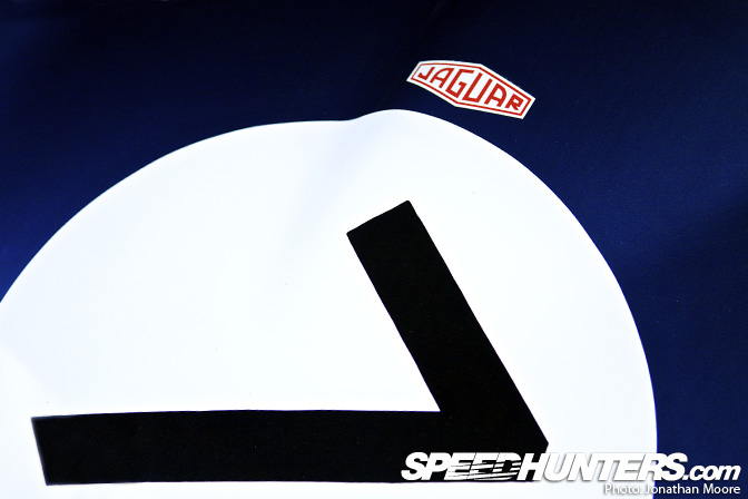
Pair a classic logo with a circular race number, and I don't think you can go wrong. There's a grace and simplicity to a well-designed badge that makes it all the more memorable and effective.
 ?
?
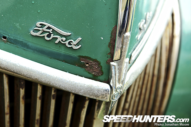
At it's simplest level, this is just an excuse to show off some hopefully interesting angles of the cars on show – but feel free to play identify-the-car. There will not be a prize at the end, I'm afraid, but your friends will be impressed. Although I will be too…
?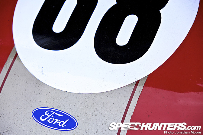
That's the only problem with getting a badge fixation – sometimes you forget which particular model it was on! Luckily some are more obvious than others…
? ?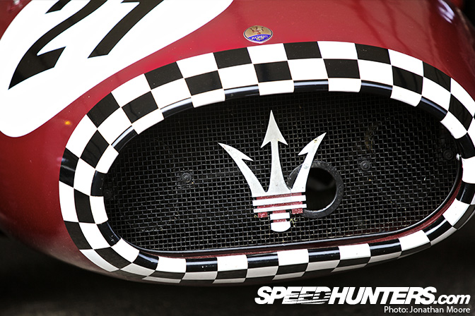
Maserati's trident symbol is based on the one found on a 16th century sculpture at the Fountain Of Neptune in Bologna, the town where the marque was founded.
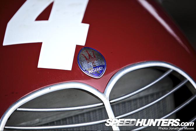
I love seeing badges showing signs of wear and tear, especially on racing cars. I think it adds to their mystique.
?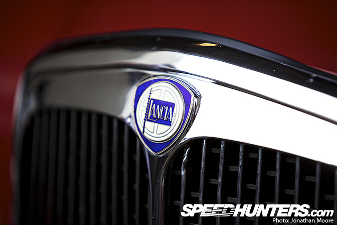
Lancia's original lance, shield and flag logo was only recently redesigned – and in the process lost the lance and flag! What were were they thinking?! Let's hope they follow the trend and return to the True Path soon.
?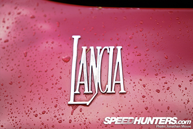
The classic combination is of a more designed badge on the nose accompanied by a typographic logo on the rear, but even the type can tell you all you need to know about a car.
?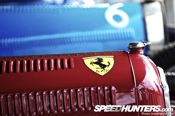
Ferrari's Cavallino Rampante adorns all their cars (yes, even their Alfa Romeos), which was designed after a good-luck symbol painted on the 'plane of an Italian WW1 fighter ace.
?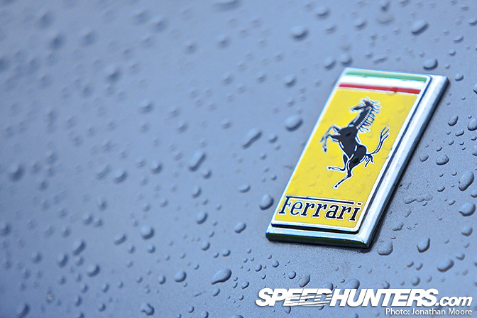
More modern Ferraris feature the rectangular badge on the nose, but you often still see the big yellow shield on the sides of the car – something that I think should be obligatory for Ferraris.
?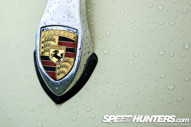
It's easy to miss that Porsche also have a rampant horse at the centre of their logo, which is a derivation of the city seal of Porsche's home town of Stuttgart. The heraldic shield was then based on the pre-war coat of arms of Free People's State of Württemberg.
?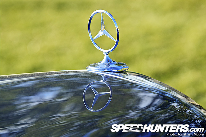
It's like manufacturers are becoming less scared of their past – plus designers are looking back to the grace and design freedom of the pre- and post-war years.
?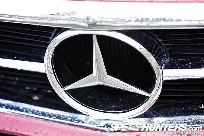
Everything's getting bigger and brasher again. They're realising that if the car is right, what looked good 60 years ago can work again now.
?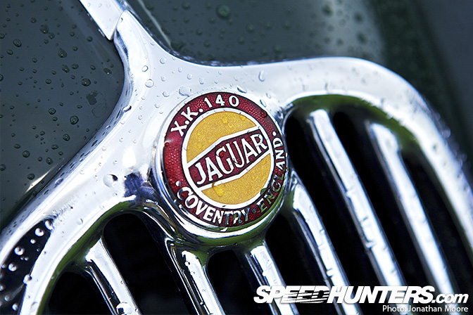
Another thing car makers weren't afraid of was diversity. Nowadays, brand management is everything: all aspects of a product must look the same at all times! The logo must be the same exact percentage of colour at all times! Things were looser in the old days. Does it look nice? Yes. Good job! Now time for a jolly nice cup of tea and a win at Le Mans.
?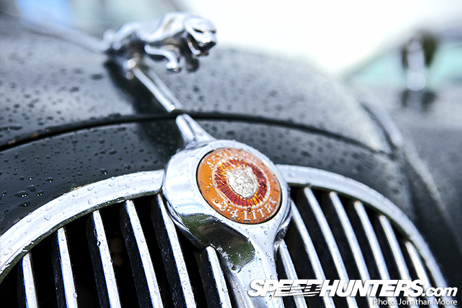
The descriptive flamboyance of the Jaguars at Goodwood was great – the badge also told the story of what car it was…
?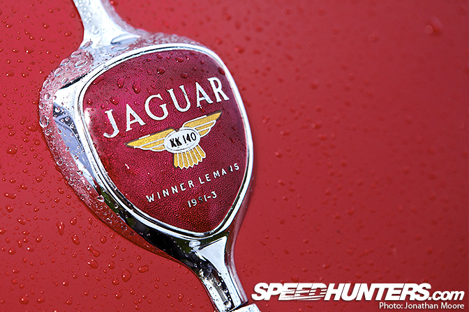
…or even which race it had run. Truly celebrating the 'win on Sunday, sell on Monday' concept.
?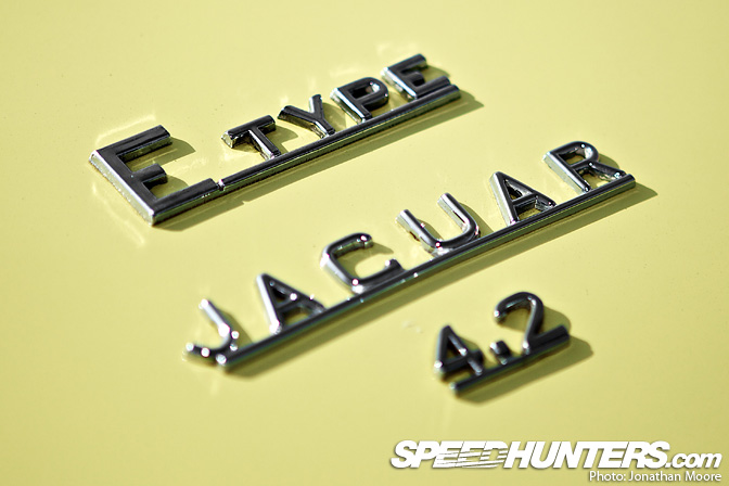
Another thing I always like is the connected typesetting of a lot of the old model name badges, like the underline connector on this E-Type. You could see the same on the old Porsches and Ferraris at Goodwood.
?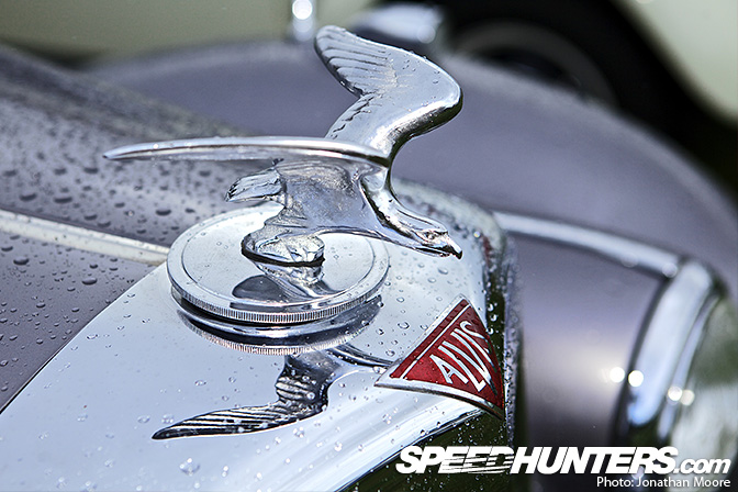
But then from one extreme to the other. Wings! Shining chrome! Flamboyance! The Alvis name was another casualty of the '70s British car industry meltdown, but had previously been famous as manufacturers of luxury cars.
?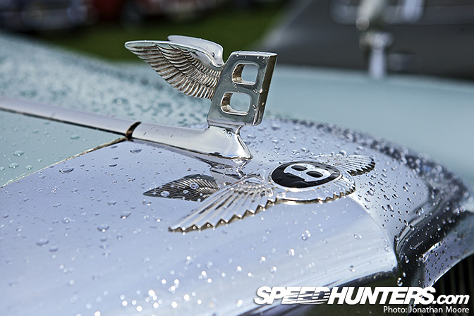
If there's a big statues on the nose, preferably with wings, then you know what end of the market the car is aimed at.
?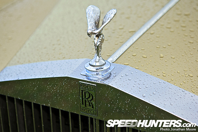
Of course, the Mother Of Them All: Rolls Royce. Rolls had a generous presence at Goodwood, with displays both in the Earls Court Motor Show and March Motor Works – perhaps unsurprisingly as their new manufacturing plant is only a couple of minutes away from the track.
?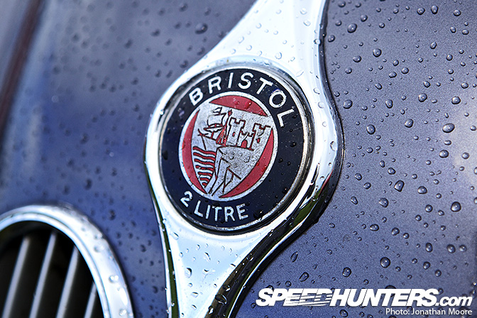
Bristol cars are a peculiarly British anachronism, making phenomenally expensive, often eccentric, hand-built and selling them out a single showroom in West London. Their history began after the Second World War: when they converted from light bombers to light sportscars.
 ?
?
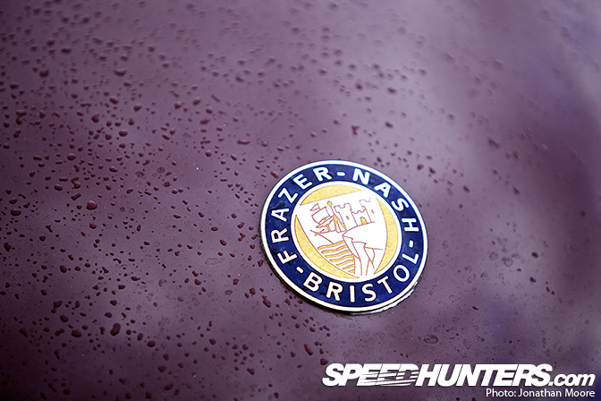
Bristol are inextricably linked with Frazer Nash Cars: the Bristol Aircraft Company initially partnered with Frazer Nash, who were also the UK importers for BMW. Even now both companies are part of the same group, though Bristol is fighting back from going into administration earlier this year.
?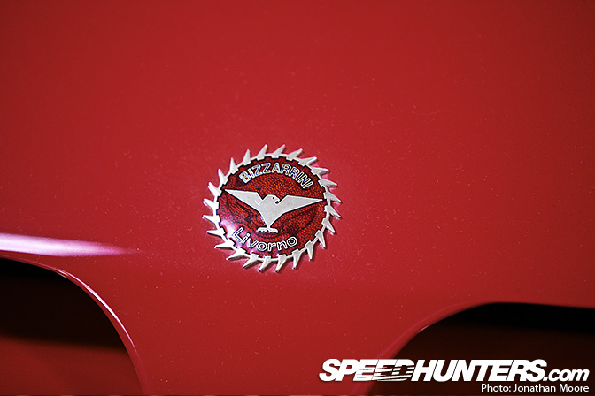
Bizzarrini are almost as quirky: the company only lasted five active years from its foundation in 1964, but still made some of the most beautiful cars imaginable.
?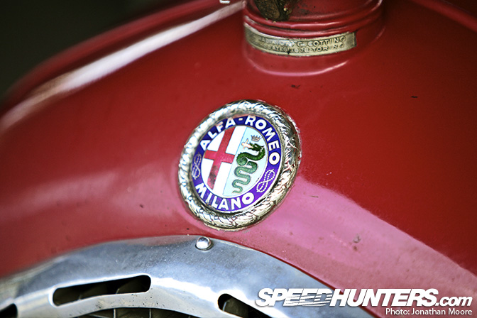
The original Alfa Romeo logo featured the Savoy knots and Milano text: the laurel wreath was added after Alfa won the inaugural Automobile World Championship in 1925. Badges tell stories! Icons make iconic cars – and they'll be more in part two, coming up after the break…
Jonathan Moore


Brilliant article. One of my favourite ever Speedhunters read.
what a nice idea! i think that the rain adds a better effect to the pictures!
Funny this should be posted, while I'm painting a mini-series of hood ornaments in oil.
no GM emblems...you should be ashamed..
Check out some car badges that I've taken pictures of:
http://www.facebook.com/media/set/?set=a.2130463829389.2109975.1479796868
my parents and i LOVE the pus that comes out from the hood on the old jags...soooo sad that they dont do this anymore...=(
What a refreshing and original article! Very good idea.
Great article. Goodwood Revival coverage here has been very interesting.
Great idea Jonathan. Please do 15 parts!
Where's the Aston Badge?????
Ferrari also uses a horse in its logo, a design derived from a downer German plane in World War 1. The city of Stuttgart opposes this use. The horse in Porsche logo is a protected trademark. Have a look http://vcos.pictures.fi/kuvat/Porsche+Museum+-+Stuttgart/P1014363.JPG/full
very interesting to see how and for what reason badges evolve from their original inception to todays versions. i lthink the meanings are sometimes strange to say the least. - you could have a month's worth of info on obsolete, obscure, rare and interesting badges! what!!.. no 'G60 grille badge' lol - Thanks
Great idea and fabulous pictures! I love the subtleties and history not often talked about with vehicles. It adds so much depth and interest (for me at least).
that first maserati badge is dripping charisma.
desktop of the Jaguar XK140 Winner Le Mans 1951-3 PLEASEEEE!!!!!
i love the shape on that badge!
@Nate, booohoooo, nothing american, so it isn't a good article, ghees... stereotype american...
Anyhoow, nice article! Looking forward to the other parts!
are u guys serious?? he has more parts to post! no need to cry about not seeing the badge you wanted to see in part 1...
nostalgia-hunting love it
rolls royce in high resolution please!
rolls royce in high resolution please!
? One of the most popular displays to take in at the Goodwood Revival – and an easy way to lose
? One of the most popular displays to take in at the Goodwood Revival – and an easy way to lose
We're going to wrap up our twenty-eleven Revival coverage with a series of desktops from both Jonathan
Some of you may recall, the recent Art of the Badge articles, fellow Speedhunter Jonathan Moore wrote