
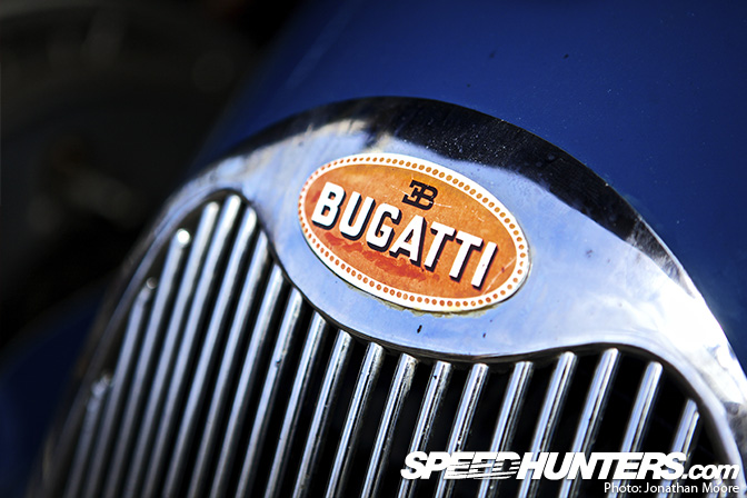
A car manufacturer’s logo tells you a lot about a car. Your preconceptions of a brand tell you everything you need to know once you see a badge, hence the number of examples where brands are merged (a positive example that could be seen all around at Goodwood being of Lotus and Cortina) or re-badged (does anyone believe Daewoo as Chevrolet?). But then there are some names that just ooze style and substance.
It doesn’t have to be a word – even abstract symbols mean that you know exactly which brand you’re looking at. The more successful and well-known the brand, the less effort they have to achieve instant recognition.
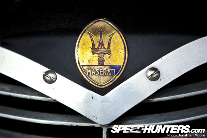
On my wanderings around this year’s Goodwood Revival I was keeping an eye-out for interesting badges. This proved to be a simple task, as classic cars offer a huge opportunity to gather up some beautiful examples of automotive logo design.
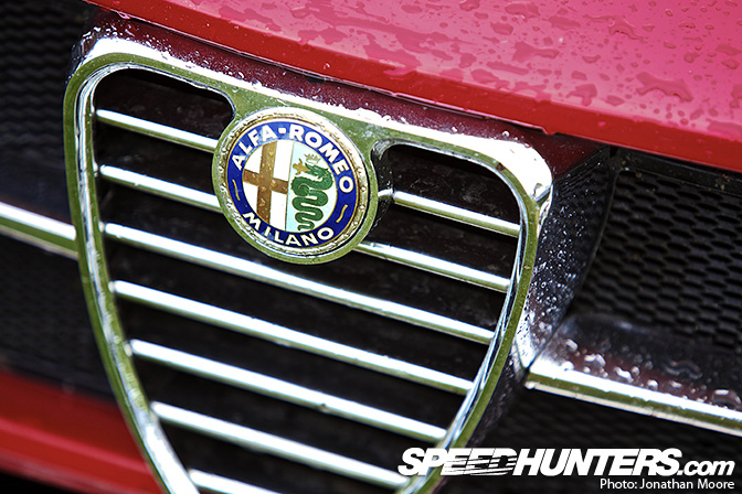
Alfa Romeo are another company who have been reintroducing styling cues from their heyday, though the more recent badge has dropped the Milano text (after the company’s manufacturing plant let the city) and Savoy knots (signifying the unity of Italy), whilst retaining the two main Milanese heraldic emblems. The red cross on white is the emblem of the city of Milan, and the hungry serpent the sign of the House Of Visconti, Milan’s rulers in the 14th century.
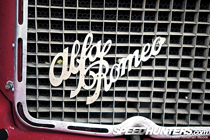
Alfa’s typographic logo is another classic design: its graceful flowing text is still used now.
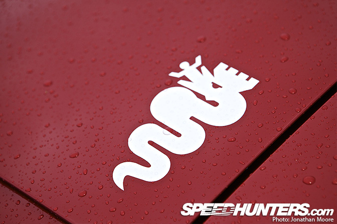
Good logos can be distilled down to their basic forms and still be instantly recognisable. The red paint helps here, I’ll admit…
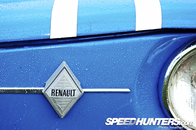
Renault is one of the oldest car makers in the world: they began production in 1899, and soon began racing their creations. The Renault diamond-shaped logo was introduced in 1924, replacing the initial round badge design. The diamond originally had a hole in the centre for a practical reason: to allow the sound of the horn to escape!
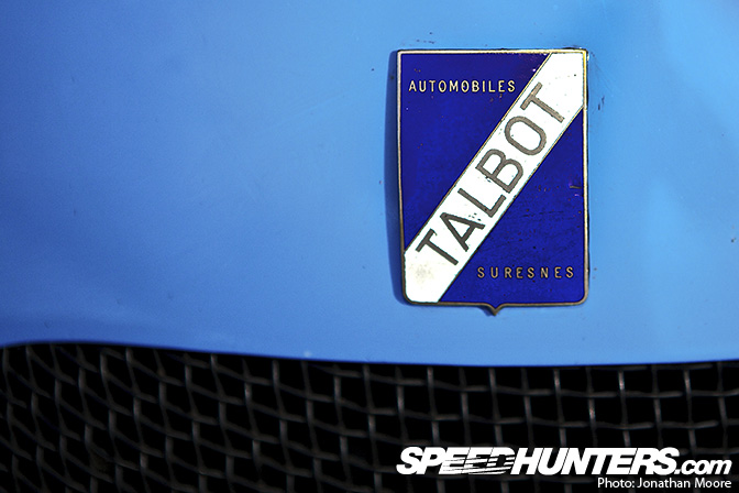
Maybe less well known is Talbot: originally a British importer of French Clément-Bayard cars in 1903, the British company started production of their own cars in 1906 whilst the French arm continued under the name Clément-Talbot marque. Since then, they’ve had more sister companies attached by a hyphen than any other I can think of. Talbot-Lago, Sunbeam-Talbot, Talbot-Darracq… This badge is from 1948, the Talbot-Lago era.
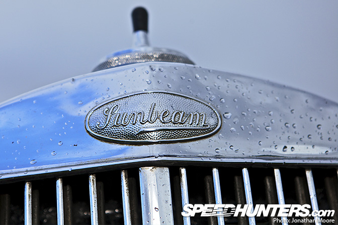
Sunbeam were founded in 1888, originally making bicycles and motorbikes before moving into car production at the turn of that century. Early racing success was backed up by Land Speed Record attempts with the Sunbeam 1000HP in the 1920s. Production continued post-WWII under Chrysler ownership, before the name died out, as with so many great British marques, in the late ’70s.
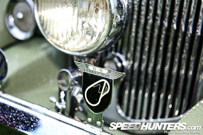
The inter-war racing of the Goodwood Trophy at the Revival celebrates the fearsome Brooklands oval: this Lagonda sported a traditional club badge attached to its fender.
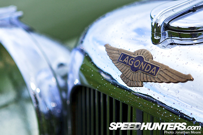
Lagonda made luxury cars leading up to WWII – after the war they passed into the ownership of Aston Martin, since when just a handful of Lagonda-branded Aston variants were produced. The last production car – which is a loose term for this one – was the futuristic Aston Martin Lagonda of 1976.
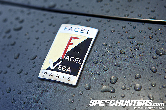
This is even rarer: Facel Vega. I must admit I had never heard of the brand before spotting the extravagant Art Deco lines of an HK500 in the queue to exit the Revival car park in 2009.
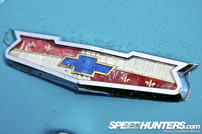
Stories differ about the origin of the Chevrolet logo, which was introduced in 1913: inspiring French wallpaper? A Swiss cross? Whatever, the ’50s and ’60s were a glory period for the exuberant use of logos altered for the style of a particular model.
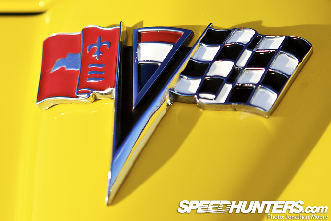
Corvette’s variation includes the Chevy bow-tie twinned with a fleur-de-lis on one flag, matched to a chequer for its racing prowess.
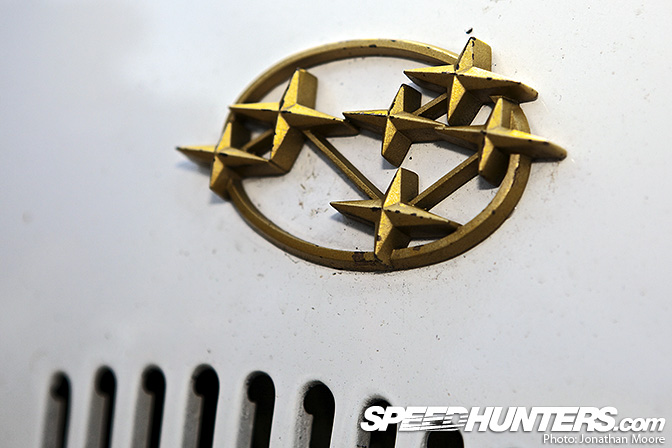
Subaru’s five stars refers to a group of six stars in the constellation of Taurus. Yes! There was a Subaru at the Revival!
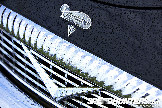
The Daimler Motor Company was a separate entity from Daimler-Benz – founded in 1896, the British Daimler bought the rights from Gottfried Daimler to use the name for their new car firm. The naming confusion is also what later made Daimler-Benz decide on moving to the Mercedes brand-name. A V8 drop-head with this badge on the front was quite something to be seen in. In fact, it still is!
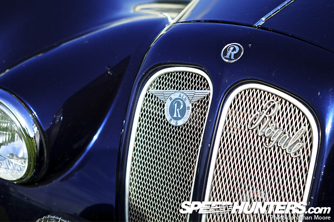
There are some cuckoos in the nest though, like this Royale. New but old, at least it carries off its nod to the past with some panache.
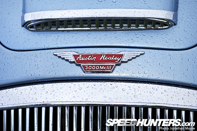
Austin-Healey, famous for its two-tone paint schemes, made beautifully crafted small sportscars, like the 3000 and quirky Frogeye. This is a car I would love to own.
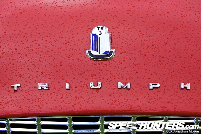
Triumph is a name that used to evoke all that was good about compact British sportscars. That the TR range ended and the company collapsed with the abomination that was the Triumph Acclaim still upsets me…
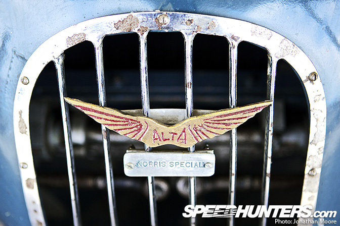
The British Alta marque saw racing success both pre-and post WWII: in fact, they were the first British constructor to put together a Grand Prix car following the war, and the Alta name raced on in F2 guise into the late ’50s.
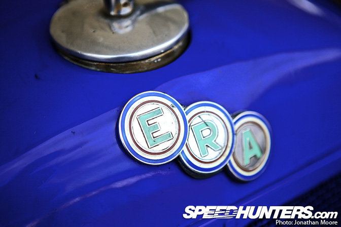
There was no doubt as the purpose of English Racing Automobiles in the 1930s. Major successes at with their ‘voiturettes’, particularly at Brooklands, were followed by the company morphing into BRM in the ’50s – and more success. Surprisingly for a marque this old, most of the ERAs built are still in existence and the majority still raced.
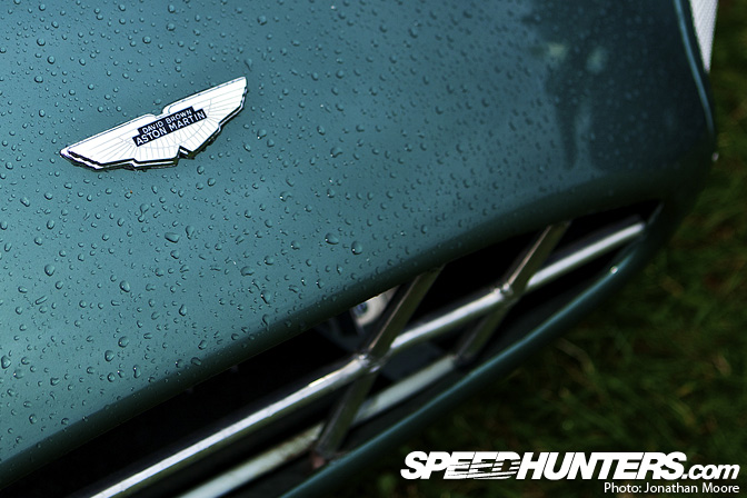
I’ll finish with three iconic brands synonymous with Goodwood. The deep metallic green of Aston Martin looks at home in the lush surroundings of the East Sussex countryside – it belongs here. The David Brown-era of Aston, a company he bought in 1947 along with Lagonda, is still celebrated with the DB prefix to all of their cars.
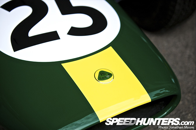
The penultimate entry: Lotus. That green, those yellow stripes, that badge. So good that even now they’re used on contemporary Lotus racers. The initials ACBC stand for Lotus founder Anthony Colin Bruce Chapman.
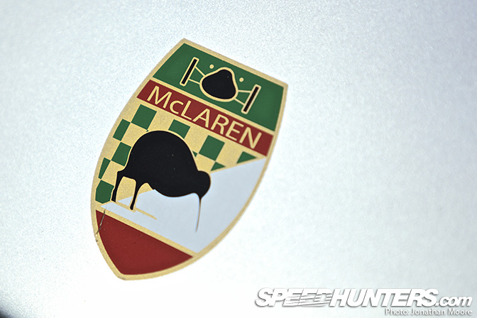
And finally, the original Kiwi emblem McLaren logo. A poignant reminder of the dangers of this track and motor-racing in general. Bruce McLaren was killed testing his M8D CanAm car at Goodwood in 1970 – four years after the circuit had closed for all but testing purposes.
Jonathan Moore


is that dragon snake eating a man?
Alfa logo.
First time I realised that the Alfa Romeo logo's dragon is eating a human. I always thought it was the dragon's tongue.
The Subaru cluster represents Pleiades in the Taurus constellation. Subaru means "unite" and also represents the Pleiades star cluster in Japanese.
This has to be the best post on Speedhunters this year.
@Donn Prud
Easily! We need education, not stance and offset.
Great Article, very informative, great photography and pleasure to read. Cheers.
Same here. I always thought it was the tongue too. That's pretty killer.
Corvettes (:
The Alfa snake is childbirthing a baby through is mouth. It was a emblem on a shield of an Saracen prince, who was killed during the crusades in rome and which became afterwards the city coat of arms of Milan.
...there are six stars in the Suby logo. Just like the constellation.
I'll agree with Bradders and Donn Prud, I slowly read through this post making sure not to miss a single letter, information like this and also the post about why rules are killing motor sports (or something like that) have been the best read I've had in a while.
but why the kiwi??? was he from New Zealand?
Yep Bruce McLaren was a Kiwi along with Denny Hulme, Chris Amon, Scott Dixon, Hayden Patton,and Shane van Gisbergen.
very informative.. i've heard a few different versions of the Alfa Romeo logo tho' - the VW logo came into being via an admin office competition to 'design the company logo'.. the winner won a bottle of wine/champagne.. it took him all of 5 minutes to come up with just about what we see today - the rest is history!
This is was a nice article on the origin of logos & names for cars. I don't think even the most devoted enthusiasts consider small details like this very often. I think my favorite backstory was that of Aston Martin, mainly because that is my favorite car brand in the entire world.
On a side note, these Speedhunters articles are still being published with some typos (as well as the posts on facebook, which I follow religiously). I love reading the things you guys put up, but the typos can kill the flow of a nice read like this one.
Lovely write-up, with a lot of great information.

Subaru's constellation is the Pleiades though, not Taurus
The snake in the Alfa Romeo Logo is NOT eating a man! It is the sign of the Visconti family wich shows the birth of a human figure.
We're going to wrap up our twenty-eleven Revival coverage with a series of desktops from both Jonathan
While walking through the Essen Auto Show the other week, Rod and I started talking about the recent