
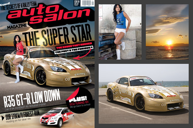
With this month's photography theme coming to an end, Rod came up with the idea of showing a different aspect of digital photography: the art of post-processing. So here's an insight into some of the work that went into Auto Salon Magazine's covers.
Post-processing is something you tend to either love or hate. I know a lot of traditional pro photographers who see it as 'cheating', but there's also a whole new generation of digital photographers that have grown up using it, and who couldn't imagine life without Photoshop or Lightroom. During my time at Auto Salon Magazine (which was sadly axed earlier this year), post-processing was a way for us to achieve features that we couldn't afford to do. We simply never had the budget to fly models, stylists and make-up artists to a location, so we often resorted to image editing software to artificially stitch our covers together.
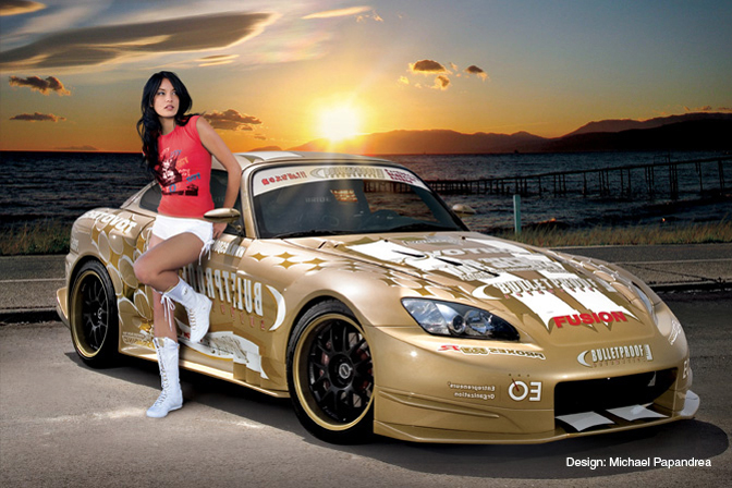
The images used for ASM's 69th cover were taken by three different photographers. Scott Dukes snuck a shoot of Ben Schaffer's S2000 in between its obligations on the Fast & Furious set, the beautiful Monique was shot by Peter Collie and the background is a stock image. A lot of time is spent selecting which images to use because you need similar perspectives and comparable lighting. The lens used and even the photographer's height can make an otherwise ideal photo unusable.
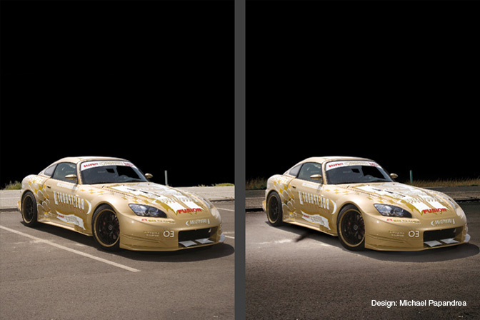
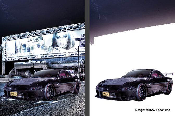
ASM's Art Director Michael Papandrea handled most of the covers, and his Photoshop work begins with deep-etching the image so that the car, background and foreground are on separate layers. In this comparison you can see that the parking lot lines have been removed, grass has been added and the ground has been burnt in.
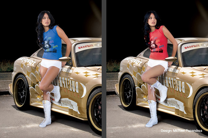
To tell the truth, the idea of incorporating Monique into the cover came about while we were sorting through the images from her shoot. We found a shot of her leaning against an oil drum so we experimented with putting her against the S2000. The perspective was off – her foot looked like it was pushing through the door – so we grafted in a leg from another image and painted in a new knee. We also changed the color of her shirt to complement the mast.
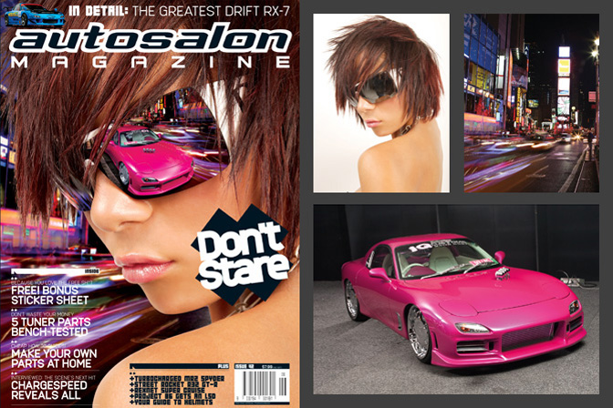
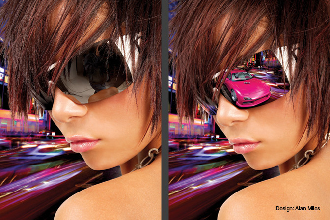
There's a little story behind this particular cover. In the days leading up to the deadline, I had to yank our intended cover car because we found out the owner was trying to double-dip (this is when a car owner attempts to get a feature in two rival magazines). As the replacement car wasn't as strong, we decided to do something left-field with the cover. Alan Miles was ASM's Art Director at the time and we had been toying with the idea of having a cover with a Neo-Tokyo feel, so we tried it out with this issue. One thing led to another and we ended up using a reflection of the car in the model's sunglasses.
We did this cover nearly five years ago, so the results aren't that spectacular by today's standards. But back in 2005 it certainly created a buzz when it hit the shelves! As a result of this cover, the model landed a contract with an eyewear brand and we were also a finalist for the Bell Awards Consumer Magazine Cover of the Year award.
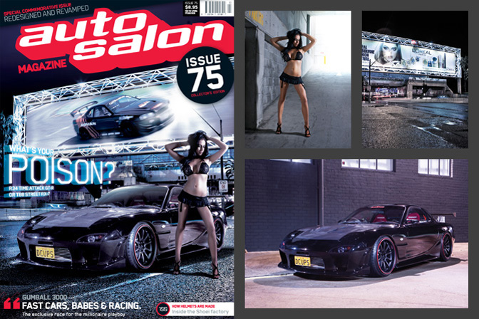
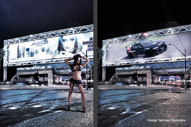
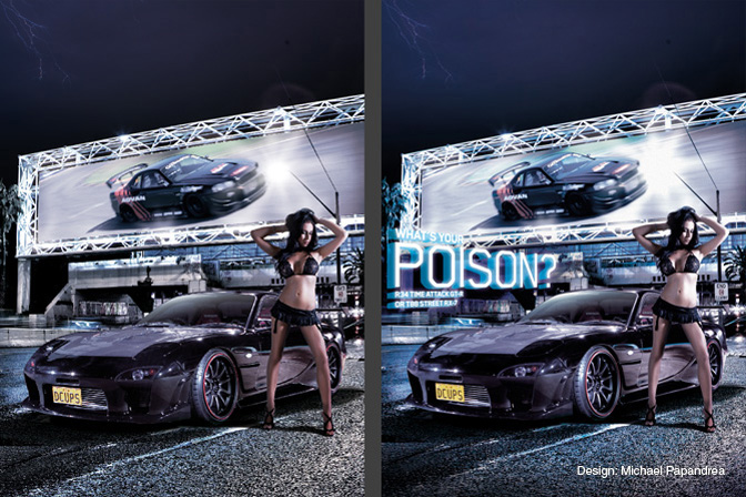
This was the cover for our commemorative 75th issue. Unfortunately, nothing went right that month. Every time we attempted to shoot the cover we were met with monsoonal thunderstorms, and at the eleventh hour we resorted to creating our cover image in Photoshop. Having a black-on-black car on the cover can be a gamble as they don't stand out on the newsstands (especially if they're shot at night!), but we believed we could pull it off if the image was lit sufficiently. Here are the shots that are used in the composition: Chesta's 'D CUPS' RX-7 (shot at our office), model Angelina (shot in our office parking garage) and a background image taken by Mark Pakula near Sydney's domestic airport.
Once the car has been etched, it's placed over a selection of background images to identify which is the closest fit. We ended up flipping a background to find the closest candidate. All of the signs in the background had to be reversed so they faced the right way. Only a few color corrections are made at this point, as the majority will be done once all the assets are in place.
The etched model is brought in and sized proportionally. Notice that the road in the foreground is taken from another image and will be blended in at a later stage. On the right, Hi-Octane Racing's R34 GT-R is skewed into position within the billboard.
Here the final image starts to take shape. The brief was for a Blade Runner-esque mood, which explains why cyan has been added. The model receives touch-ups and shadows while light flares are introduced on the billboard.
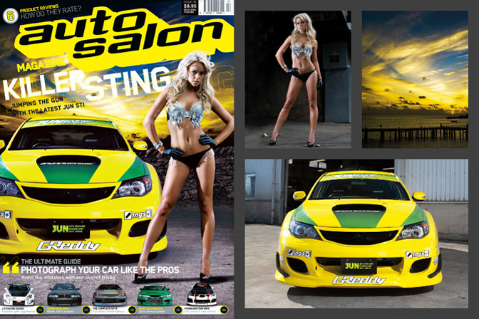
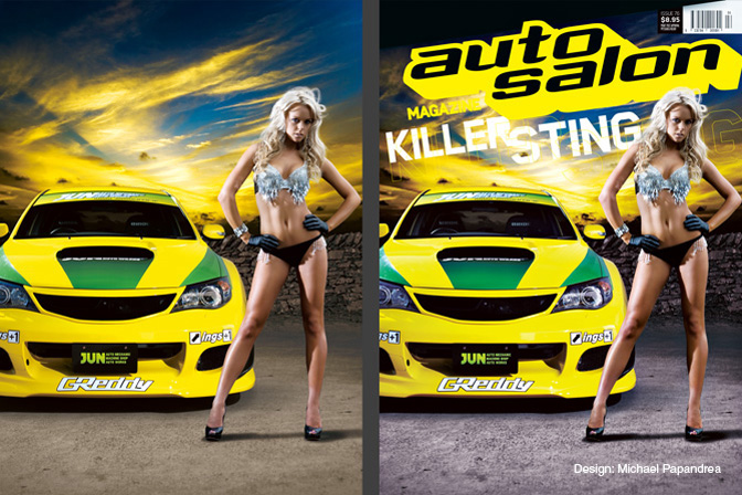
As we only had an hour to shoot JUN's STi after Tokyo Auto Salon, we didn't have a shot that screamed 'cover material'. So we 'chopped one together using a model from Sydney and a background from Europe. On the right you can see the three original images that were used. A fourth is also used to create a break between the foreground and background.
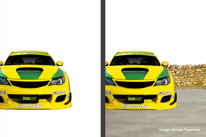
With the car etched, a dummy page is created so we can visualize the composition. On the right you can see there's a problem with the ground, as it's out of focus while the car is still sharp. A new photograph of asphalt is taken to fix this.
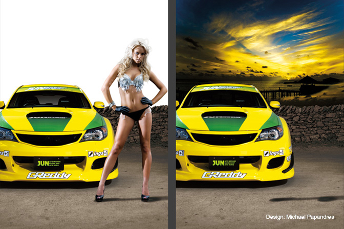
Shadows make all the difference and once added the image starts to look more realistic. You'll probably notice that the lighting of the car and model are different, and we tried to mask this by introducing a light source from behind her right shoulder.
The background is pulled down behind the brick wall before final color corrections are done to make the cover more vibrant.
Today, you'll be hard pressed to find an image in a magazine, billboard or advertisement that hasn't been tweaked or touched-up. But when we started to manipulate images back in 2002, we were stepping into unknown territory. Looking back, some of our techniques are prehistoric in comparison to what can be achieved with the editing software of today. A big thanks to Michael Papandrea, Alan Miles, Garth Ivers and the photographers for allowing us to reveal some of their tricks of the trade. Hopefully it shows what's possible long after you've released the shutter.
- Charles Kha
OFFICIAL SPEEDHUNTERS SUPPLIERS


Pretty sure after this much work, it's no longer "photography."
You can hate or love it! but it sure is art to do it this way! especialy if you have tight deathlines!
I'm a sant, i only change the WB
I personally dislike how it's all photoshop'd now.
Yeah really, This isn't photography its just Photoshop, and not very good Photoshop. If anything its half assed graphic design since their is obviously no effort to set up a shot and light it properly. Just a tip .... Shadows should all be in the same direction unless theres more than one sun somewhere.
maby some wallpapers?
I dont like it.
Everything looks so unnatural and perfect. Just too perferct to be real.
It's digital art, not photography. Most of the "amazing" pics I see now have been manipulated so much that they are no longer photography.
Very interesting story, thank you for it.
This goes against all true photographers/studios that actually use real people in real environments, to create a REAL photograph. PP is great for adjusting WB/Exposure/Highlights etc etc, but when you use it for a magazine cover? How bout you actually take some real photographs for covers instead of stitching photos together to create excitement?
That's why i've never even heard of this auto salon magazine, probably b/c it's so shitty. I'll stick to my sport compact car and other publications thank you.
insane work. thats called creativity
surely the point of a high quality composite images is so you can not tell. These (and Import Tuner) covers are nasty. Lighting, shadows, color tones all over the shop. Someone needs a color theory and lighting course.
Individual aspects have some good PS work to it, but as a collective, its not very good.
Great magazine otherwise, sad to see it gone.
...dont call me Shirley
You guys complain too much. Good article, I liked seeing how chopped together these images were.
WOW that´s a looot of post-processing im amazed about the fact that every single cover fully created from scratch, nice work guys!
I stand with the traditional pro's on this. I find these kind of over-processed pics tacky. Overcast skyes, added lens flares and over-saturated colors are needless "eye-candy."
Adobe photography shop
Im with first comment
This is a cool surprise to see! I love your magazine man...that was a hell of a great looking feature you guys did with my car. Charles and his crew are the best!
will you hire a gis image analyst? i am good a ps!!
HIRE ME
You have to do what you can to get the job done. I few this skill with painting and quilting.
Hello,when this is todays photogrphy ,i say good night to the real world.
@
If you notice every publication does this.. Its hard to get the right picture all at once especially for a front cover
@ =)
Then why not go back to traditional photography with proper lighting and exposures instead of all this digital stuff? Car should stand out on it's own uniqueness, not some skank-ass chick photoshopped onto an image. This industry has evolved to a point where it's not about the car anymore...
this is so fake. This is like watching porn. Not as exciting as the real thing.
Girl in the first cover is a terrible chop... love ben's car though
Epic fail on the shadows on last;) Girls shadow casting right, car from above casting left..;)
Amazing all the things people can do to manipulatie photos. This has changed the way I look at covers of any magazine.
I only change the size, I...hmmm, it's still photography but not as natural as I'd like photography.
I would consider that to be 'not so good' art.
you could spend as long as you want building a house out of @$£%,but it would still be complete rubbish.
*it may appeal to the under 16's market though.
DCUPS' RX7!!!! my favorite FD of all time
Haha I didnt notice the shadows until you pointed them out Mark!
Not particularly high quality photoshop work on any of these I must say. As both a photographer and professional photoshop user I have a very divided opinion on this. I believe that photoshoped "art" really needs to be a piece of art and be recognised or noted as such, so if you made it obvious to the reader it was art then that would be ok, but by and large you should just take a proper photograph. As far as the photoshop work is concerned, I can provide you with a few tips, I'll use cover no.1 as an example.

1 - Your original photo has the shadow heading in the correct direction, but with your new light source (the sunset) it should be heading toward the cameraman.
2 - The new lighting conditions will alter the colour and contrast of the original image. Try using Brightness and Contrast in combination with Colour Balance to achieve the correct orange tint.
3 - The girls shadow is wrong. Not only doesn't it match the original light source that the cars shadow is pointing to, it does not match the new light source either. It should also face the cameraman.
4 - Finally, there should be a reflection of the girl on the car, and if there was a shadow of the girl cast on the car (which in this case there would be a very, very light one) there would be no original reflection of the cars surroundings on that shadowed area as the girl is in the way of what is being reflected.
Hope this helps with your work in the future!
It's art. You're an inspiration man.
Not a fan of this fake crap at all. Sorry
Art, pure art!
Thanks for this feature, very interesting to see how they make covers.
Of course, I agree - this is digi art, not photography. And I'll be honest and say I dont like car covers with flashy rides and semi naked girls. Gets too old.... but like I said interesting read nonetheless
Wow, half the guys saying that this isnt good photoshop probably wouldnt have noticed if it wasnt for this blog. lol
Some of you are missing the point. Alot of people don't care about "real" photography. If it stands out, it sells.
@ =)
I work for a much larger publication that does not do this.
im surprised speedhunters allowed this on their blog. the quality of photography is weak. take the car to a real location with a model. not just photoshop them in. thats what location spotting is about...... i hate altered photos when it gets beyong just a few touch up stuff!
So many of you are judging this simply from a technical photo shop perspective but don't take in mind that the time to put a cover together for a magazine of this size and monthly deadline is typical a couple days not weeks like most ads and larger scale publications have.
Furthermore, the point of covers is to grab attention and in my opinion all these succeed immensely. The shadows may be off but 98% of the public won't even bat an eye at it. Ultimately you want to create the best image possible but when time and other restrictions come into play then sacrifices have to be made. It's that way in every line of business.
You can hate on the girls all you want but ultimately that's a huge selling point, if females didn't sell car magazines they wouldn't be on 2/3rds of the car covers out there. Blame yourselves if you want to point the finger since it's the buyers that dictate what sells and doesn't.
fuck photoshop
Peter:
Deadlines be damned. If the editors and writers all have time to collect stories, write them and edit them, why can't the photographers do their job the right why in the same amount of time they have? The deadline excuse is silly. If they can't meet their deadlines and have to digitally create their cover photos, what does that say about the photographers working for the magazine? To me, it says they're lazy and the photoshop is an easy, quick and simple fix.
There is so much hypocrisy here...
Most of you never would have never even had a clue how these covers were done to begin with.
I also think a lot of you would be terribly disappointed if you saw how processed some of the other photos on this very website are.
Peter Tarach well said! That was my point i was going to say. Im a Graphic designer too.. and i also worked once as a freelancer for a car magazine. And i know how tight the deadlines can be with some last minutes adjustments. but like you said 98% of the people wont even notice, as the matter affect they buy other magazines that has been poorly photoshoped and didn't even notice a thing.

As a Graphic Designer i hate it when people say that when you use Photoshop on a cover (or whateva piece/photo) it doesn't have the same value anymore. And that is just not true, photoshop, Corel Draw and any other photo editing software is just another tool to help you enhance your photo of your final art. keep that in mind
sorry for ma bad English though is 3 o'clock right now and im sleepy and english isnt my native language. =P
@Peter
quote"Blame yourselves if you want to point the finger since it's the buyers that dictate what sells and doesn't."
....sounds like the buyers spoke. A magazine only gets canned if it cant get enough buyers to make it viable hence the demise of Auto Salon
Sorry, but Speedhunters quality zar should have caught this one.
Wow Charles, tough crowd huh?
What the critics don't acknowledge is that every magazine has its own style and Auto Salon's covers and design were the way they were intentionally. That said, it doesn't mean that it ends up being everyone's cup of tea. I remember the challenges we had when launching the title back in 2002 with shooting many of the cars in a portable studio at shows, which was a nightmare but was done to be competitive with rival titles as we cut lots of costs and got to scoop the best cars on debut. We were also the first Aussie car mag to attempt 100% digital photography - which at the time was pioneering though the quality suffered for quite a while because of this.
By the way Charles, thanks for the invite to contribute something to the final issue - I was only the guy that created the damn title in the first place. I also remember plucking a spiky haired kid from the corner of the room one day and giving him the chance at something greater than designing t-shirts for us. You're welcome mate.
Save doing a photo shoot, just take pics and chop'em up.
Handy, but time consuming...
Then again, setting up for a photo shoot can cost time too.
Has it's pros and cons.
Turns out good in the end and the reader would not even know.
I think it's brilliant! People don't realize how difficult it is to do a clean edit in programs like Photoshop!
I always loved autosalon, and while the shadows etc may not be perfect i still really like how they did it. Being based in Aus and having many overseas cover cars they couldnt afford to fly models etc to get a good cover shot in the style they wanted (as he said) Personally i think most the covers looked great and the photographers there took some amazing pics
Wow, just wow. This is low. There's people out there who could go out and shoot a perfectly good cover shot, with minimal post processing (e.g white balance correction, colours etc) and they wouldn't be able to get work with a magazine like this because he magazine standard is "photoshop the hell out of it and don't even get the basics right"
Really, the use of photoshop for stuff like this makes it pointless even trying to get a good photo for a cover shot.
For all the haters out there: Put yourself in the Editor or Designer's shoes before you start criticising them. Working with a minimal budget and 3 week deadlines to produce a 165 page magazine every month isn't an easy task. And if you think it is, try to get a job as a photographer, designer or writer at a magazine and be proven wrong.
@_G_T_P_: what does "professional photoshop user" mean? Are you a Graphic Designer or just someone that that users photoshop in their bedroom? I hope you are a designer - since you're giving out tips - but why would a designer put down "professional photoshop user" and not clarify what they really are. Strange.
Autosalon was a unique magazine and instantly recognisable from their covers. Sad to see it gone. Thank you for sharing your insight into how much effort was put into each magazine cover.
I for one am not sad to see this magazine gone because of all this fake-ass, photoshop shit. Stick to the essentials like a vehicle, a camera, a good location and, optional, a beautiful woman/women. Photoshopping in order to meet deadlines is a sad excuse.
I guess all the other mags that have actual women on the cars taken at an actual location still prevails....
Hello all,
I created most of the covers in this article and i agree with most comments in this thread. However due to the content being put together monthly it was very hard to organise the perfect cover shoot - plus we were on a very strict budget monthly and couldn’t afford to spend big bucks on pro photographers and beautiful models etc.
With a small team, 2-3 week turn-around each month Photoshopped covers were the way to go. Most of ASM covers were decided the day before deadline and usually very late at night - given me roughly 3 hours to create them - which is why you can critique them in detail. And i agree with your comments so no hard feelings.
Majority of ASM feature cars were shot all over the globe and shot either months before they were featured. Most of the cover girls were shot locally and needed to be chopped. Some of the girls due to budget weren't so attractive and needed the Photoshop diet.
Working for a Magazine is tough and not glamorous as many think. It’s fast paced and about delivering a publication within budget. Quality was important however publication sales was key.
Thanks again for your feedback - i know longer work for a magazine and my last minute photoshopping days are over!
Peace!
MP