
Finalizing the livery, one of the most important aspects of the RTR-X, has been a challenge to say the least. Andy Blackmore is so good at making anything look good in renderings that every idea we had looked incredible. I have spent a lot of time staring at all options and I am in love with all five of these livery options and am reaching out to you (Speedhunter’s readers) to help make the final decision on which livery to go with.
The base color of all of the options is the same graphite metallic and the Team Need For Speed graphic will be surrounded by a satin graphite to make it pop like you see in the renderings.
Regarding these options with green accents, the wheels will be the same exact powder-coat color of the wheels that are on my competition car (there are references in the last picture of this post).
I do realize the wheels look weak in these illustrations, I can assure you that they will look like the initial rendering you saw last week, so try to visualize that when your making your decision.
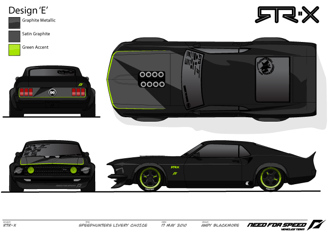
The writing on the wheels might move to the lip or be removed all together. Simply post your vote for Design A, B, C, D, or E in the comments section when you decide your favorite. We need to have a decision by Thursday evening, so let’s rock the vote!
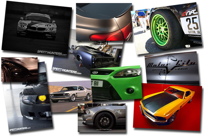
Here are some references that were used in explaining the direction for the livery\color-way design.
Once again, thanks for all the support regarding the Team Need for Speed RTR-X build; it is awesome to know you all are as pumped as me for this!
Thank you in advance for your time!
– Vaughn Gittin Jr.
Team Need for Speed RTR-X Build
UPDATE: Voting is now closed. Stay tuned for the results on Thursday
OFFICIAL SPEEDHUNTERS SUPPLIERS


E
A all the way
A for sure. The other ones don't seem suited to that kind of car.
D
AAAAAAAAAAAAAAAAAAAAAAAAAAAAAAAAAAA
Design E for sure!
I just thought to my self "Oh look! It's a Xbox on wheels!" But yeah D looks definitely the best...
E is sick man, pimp E for sure. Those wheels are clean, and the green accents scream JR/Monster!
Is there a significant difference between B and C, and also between C and D, I feel kinda dumb asking but I dont see it. Also, in regards to the last 4 designs, it kinda reminds me of a Monster Energy drink can color scheme. Are you trying to represent your sponsor at all or was that just your color combo of choice?
Personally, I think that Design A looks the coolest, reminds of that Rauh Welt look, but then again MAtte Black with Matte Bronze Meisters might be jocking a little too much on their Porsche's scheme.
I don't think this comment helped at all...personally I think this car should stray as far away in design as possible from your competition cars. Not that I have anything against your competition cars, but you said yourself that this car is a representation of your personal style choices and all. Im assuming you didn't have much say in the design and livery of your Formula D car, so I think you should use this oppurtunity to be more creative and unique with this RTR-X concept you have going on.
Anyway, thats my 200 cents, sorry for the long post
Eugene
edit/repost - I see the differences now, still think Design A is the coolest
Vote for Design E !
Design A

I think that this one works the best. I prefer the bronze/gold wheels. I also like how uniform the design looks as a whole. Very snazzy
E!!!!!
initial thoughts were quickly 'C' for sure, but perhaps something like 'A' would look more serious for such a tough car. mmm. c looks sweet, but a looks timless, clean and tough. hard call!
definitely the first one with bronze / gold wheels. Design A.


we dont have anything with white wheels?
well for me at least. oh and design D and design E is the same (at the time of posting). pls fix it.
Design E I might say. looks very stylish
A.
dark and menacing.... the bright green accents on the others just look cheesy.
design A obviously.
C
e
Design D for me guys
D
Design E
Design D
E
design e
e
Altough I have always liked the neon/lime green color, it just doesn`t look right if you know what I mean. The black and gold livery on the first picture is just staggering, especially if you picture it really on the car. Don`t know, the neon green wheels just don`t fit a classy and mind-blowingly good designed car like that ( they are a little too much Matt Powers, no offense ). But my vote would definetly go to the first version. Altough if you do opt. for the green version, you could have the windows tinted lightly green to give it a little more accent.
VOTE: A and E coulnt decide
AAAAAAAAA!!!!!
i agree with 77 E is the best
A
A ALL DAY
Got To Be E
E
cause
i'm not to fond of all green WORKs
gold is a bit conservative
and green stripe is the detail that makes the difference
A
C
EEEE
Gonna go with E
First. Design 'A'
A or E definitely. A is more of a classic look but on E, the accents seems to make it stand out more. The wheels are a must
E
A
A, but E is a close second
A
E
AAAAAAAAAAAAAAAAAAAAAAAAAAAAAAAAA
c for sure
Definitely design C
A or D.but...hmm AAAAAAAAAA!!!
design C. It rock! Cant go wrong with that!
E fosho
I wote for design A.
I think D looks the best on a car like this.
E is hot, just drop the green decals to dark grey.
A or B
Imma go with E
I vote design C.
Man! I see your dilemna. After thinking about it, as you said the wheels don't look as aggressive in these renderings, I think green super wide Works will rock. This is Vaughn frickin Gittin Jr we're talking about here. You gotta rock the green wheels. It ties all your Stangs together...Green wheels to the drift Stang, RTR to the rest of the RTR family. I really dig the green "pinstripe" on the hood and rear end. Makes the front end look RAD!!!
CCCCCCCCCC
a
A for sure
I like the design E it seem to accent everything.
D just seems a little much with the full color wheels..
D
JR, go with design E that's looks really wicked with the bright green accents on the hood and black rims.
A
Design E
Design C for me
E or A but E looks perfect with those color coded wheels...but so do gold wheels on A. But then again, E has the accents..looks perfect
its a tie between A&E
E!! Ties everything together perfect.
A !!
E
A OF COURSE!
E! The green hoodline adds something special and the all green wheels is toooo much!
E
D!
I like C the best.
E all the way!!!
E, for sure.
E is the best !
A with Green lights in the grille.. the taillights would be nicer either clear or smoked too
i like design e
I vote for design A. Matches the gold box running the engine.
E looks tight.
A: Keep the gold and grafite
A...
Design A
EEEEEEE!!!!!
E!
E looks the best.
B
A is my first choice, reminds me of Rau-Welt Porsche which is one of my all time favorites
C is my second, if you go green go all the way baby!
Can i get a louvered rear windshield?!?
E
for sure.
Make the wheels less green thou.
Design E
E
E
design E
A would be my choice, then B for a second. all the others look wrong
E is my favourite... :):)
A!!!!
E looks the best in my opinion!
E looks best. But remove the writing on the wheels they are ugly!!!
A!!
I dont want any neon colors on an old mustang, seriosly, keep it old school!
Desgin E
Design "C"
either A or D for sure. I like the accents on D but A just looks hella mean
A
A
E
E for sure!!!
A or E
but A before E
I would go with D as my 1st choice and then B as a close 2nd.
E
A =)
AAAAAAAAA
E
E!!!
Design A but with the green on the hood?
definitely E
A
E !
E!!!!
Tripple A
D for sure.
A with matte black rims would be hot though
I'd go for E
Echo FTW
Echo FTW...
How copy?
A
A!
E with A's color and yellow lights.
design E for sure. fits well with the other nfs cars
a then e is a close second
A
E for sure, but maybe with the window decals also in Green?
Design E is the best!!
EEEEEEEEEEEEEEEEEEEEEEEEEEE
B
Design E!!! A has been done before, go big and be different
B
D
A
E
i'd go with E
A
E
Easy E
B
b
C
A....no green, sick of it this year.
A
E ftw. It's tough, subtle and edgy. I like...
E
D
D
A
design d
E
E !
A
A, B, or D. Not a fan of the accent green on the hood
E is the one for me.
i choose D
A because it fits better
A
A
I say Design A. But if I were to make any changes, I'd stick with a brighter color for the wheels (gold) and make the lips powder coated silver.
A!
RWB Style
E!!!
A
It suits this car much better
A
leave the green out .
anything else is good, but forget green accents.
E is the best one.
E ! (But if you replace the green color by gold it will be better in my opinion)
AAAAAAAAAAAAAAAA
A
E
EEEEEEEEEEEEEEEEEEEEEEEEEEEEEEEEEEEEEEEEEEEEEEEEEEEEEEEEEEEEEEEEEEEEEEEEEEEEEEEEEEEEE
A makes it look hella mean which is the way to go
A,A and again A!!! BUT! :).. both lights should be the same colour(xsenon,led? wuold be nice), and the hood graphics are a little too much, maybe a smaller triangle in the left/bottom corner of the hood..if the rims will be gold, some gold accents wouldnt be bad either.. The flat colour is the best idea you had for the car, but please, the overfenders in the same colour as the car.
Thats my design opinion, cant wait for what's it's gonna be!
D
How would E look with the gold wheels?
First option
c
design e. by a long way, i reckon.
B
A
Design E!
A is the best, only because I don't like the green...keep the wheels bronze for shure, maybe do E just replace the green with white
D looks so dirty!
E
Car E
D
Design D for me!
Design A is the best for me
design 'C'
maybe a takata green?
i really prefer design A though...
still, a very good looking car in any color combo
E too!!!
E
DDDD ,, .. ,, .. espero ancioso por verlo terminado,,,, goooo JR !!!!!!
totally has to be E
E
a
'D'
Option 1 for sure
A or D
A keeps it classy.
Design A!
A! is the best
d
E
Design E
dEfinitEly!!
E!!!!!!!!!!!!!!!!!!!
"E" except matte charcoal wheel centers. Looks great!
design c.
E
A, by far.
D..
i think you guys could have used a bit more imagination... matte black is SO played out its not funny
A
A for sure !
B!
Is there a significant difference between B and C, and also between C and D, I feel kinda dumb asking but I dont see it. Also, in regards to the last 4 designs, it kinda reminds me of a Monster Energy drink can color scheme. Are you trying to represent your sponsor at all or was that just your color combo of choice?
Personally, I think that Design A looks the coolest, reminds of that Rauh Welt look, but then again MAtte Black with Matte Bronze Meisters might be jocking a little too much on their Porsche's scheme.
I don't think this comment helped at all...personally I think this car should stray as far away in design as possible from your competition cars. Not that I have anything against your competition cars, but you said yourself that this car is a representation of your personal style choices and all. Im assuming you didn't have much say in the design and livery of your Formula D car, so I think you should use this oppurtunity to be more creative and unique with this RTR-X concept you have going on.
Anyway, thats my 200 cents, sorry for the long post
Eugene
Hard to decide, they're all pretty cool.
But go for D.
Desighn D
D
E but with green wheels
design A
E
Looks great!
I vote for Design D!
(B looks great too)
E and i hope if u change the glass stickers to green to match with the stripe and the lip
i like the idea of the green accents but i think green is too over-used. maybe you could use orange instead (going back to the classic orange and black striped mustangs). or if you wanted something really cool you could go with light blue and orange like some of the old racing mustangs (see pic below).
http://farm1.static.flickr.com/158/373597080_cd6eed4efe.jpg?v=0
good designs though, i am looking forward to this!
I day "E"!
Design B
E
A
I like E, but with the RTR-X in white?/silver? on the side, like it is on A.
E Clearly
Its got to be design E
@AEkyuni
E has a green trim around the hood, where as D doesn't
E !
E all the way!!!
D
E
D, just the right amount of color.
E is where its at
I vote 'A' as well. The green for Junior's Monster Mustang Drift Car works, but the green isn't working for me in this layout.
Hope this is not a double post. I vote A.
A
d
I'd say the last design.
E
E
Design D
definely E!!!
monster $$$$ theme for this project = weak.
bronze is better
A
E.
wish there was green accent on the trunk and the rear wing as well.
Go for B. Simple but Evil
A for sure.
Design A!
D
I vote for A, it's a cleaner design also the gold on black works wonders, whilst keeping the true originality of the Yellow High beam covers.
a for timeless badassery, b for the cool factor
E!!
D
Design A for sure, the other ones won't suit that kind of car!
Design D for me
A
E
A bc less is more... keep it simple and clean
B all the way!!
@ lowNSlow- All of the Renderings are choices that I chose for no reason other then I like them. The green accents offer a bit of "noise" if you will and is also a throw back to a 32 Ford I used to have. I know it seems a bit coincidental with my relationship to Monster but that is the truth. We also tried Metallic blue andOrange but it just didn't work.
Thanks for everyone's time! So funny I am on the same page with most everyone, A AND E are my absolute favorites and it seems like those are the majority vote so far. I will be thrilled with either! Keep the votes coming!
E!!!!!!!!!!!!!!!!!!
A, definitely
F*#K! This is just going to be an insane car.
I go for option A or E.
E for sure
A for sure!
A
E or D, but yeah, flash green with matte or satin bk, <3 it!
Design E!
E!!!
A
D
D or E for me!
A!
E
runner up: A
E No doubt!
do E. maby a different rim though. Work Meisters would set this off in chrome.
E
D and i havnt seen anything this cool since ryan hampton's camaro
EEEEEEEEE!!!!! e is the best. got to go with e!
d e or a
E
E
E
E!!!!
E for sure
A
A, Deep dish bronze/gold Work Meisters on a Black car. Yes Please!
AAAA, John Player Special baby
A
A is for AWESOME.
A. ONLY A.
I say E but with the wheels with a black lip and green insert
Definetley design a
the green accents are cool and all, but...
A get my vote, simple and clean, looks so aggressive.
EEEEEEEEEEEEEEEEEEEEEEEEEEEEEEEEEEEEEEEEEEEEEEEEE
Thanks for all the comments Guys. I've also had a chance to look at some of the comments which are in the queue to be posted, so just to clarify, we looked at white wheels, orange accents etc. The Green accents are just that, accents to punch. It isn't Monster Green as such, but more the colour associated with Vaughn in 2010. For example, we tried Blue, which relates back to the RTR brand and it just didn't work.
-
So keep the votes coming - Thanks for the one letter answers. Helps us when adding up
-
Andyb
E the best
D
I preffere it on matte black, and gold rims
E for sure
C. but bronze. screw neon green. do it now says me.
A.
and please lift the rear a little, looks like sagging leaf springs. (i know it's gonna have coil-overs)
E
D
A gets my vote, and stick with the bronze wheels
i vote for "A". bronze wheels offset the look of the car.
A oe E would b cool
E is the best with the green highlights
D!
A!
EEEEEEEEEEEEEEEEEEE
it's the best!
design B for sure
E, please and thank you!
=D
E looks the cleanest.
A. Black and Gold like John Player Special Livery...
A, please.
A all the way !! looks cool on this car !
A
A
My vote goes to Design "C"
AAAAAA
E looks interesting
cant wait
i would say , A with green lights.
D
A
All the Way!
AAAAAAAAAAAAAA!
D
E
A
D
Clearly the "E" for sure!!!
AAAAAAAAA
A
E, the lime green wheels look, IMHO too pimp. I think the green accent is better, although I would've gone for red instead of green. Anyways, better have green lips than full green wheels. E all the way, A is too clean, boring clean.
E PLEASEEEE!
D
E!!
A
A.. The gold looks kind of retro, especially with the black paint, & the coloured fog lights add a certain something to the front end
A because green is dumb
Design E, of course!
E!
C
Definately A
A
No more green on classics ...
A for the win man! Lost count...lolz...
Def has to be EEEEE!!!
A
not a fan of the " hype fluor" thing, you should go with the "A" livery, at most, keep the spokes black, and the lip of the wheels golden brown!
AAAAAA
E for the win !!!!!!!!!!
A
A for sure...looks alot like a rauh welt car...aka the most bad ass cars around
you can quote that Gittin
A all the way!
A
A!
Choose A! For that classy look.
I'm going with E but C was a close second.
design E!!!!
E design is the best! Not too much not too little...
C
Definitely Design E, keep the wheels the way they are though!
E. The lime on the hood is the best part of these set of designs, so I'd be sure to at least pick a scheme that has it.
E. The lime on the hood is the best part of these set of designs, so I'd be sure to at least pick a scheme that has it.
Design E.... FTMFW !!
A for Awesome
E. Like the green accent around the bonnet edge and rear light panel, plus the highlight around the edge of rims. All green rims a bit too strong, IMHO.
Rgds,
Ben.
A
D
C and E but i don`t like the rims
E
A
E
E
A is the most suitable style for this chasis...together with the C accents in the same color of the A wheels
E
Design E
E hands down!
A or D for sure. Do would be cool, if there was "Need for Speed" in green on the trunk. This way, I got to go with A.
Design A
E
Option A.
However I'd do the velocity stacks and STR-X in the same color gold as the rims.
IMHO the neon green is to much.
E. E. E. E. and E. A.
Def' E
D is sexy
D
E
"Design C" furthur more...green centers on the wheels with satin black lips and satin silver screws...satin silver intake stacks...
A for sure, it has that class look to it!
E
I'd prefer design E, but I wouldn't do the inner lights in that green color, change it to black like the normal front lights...
Just an idea
EEEEEEEEE is my vote! even though I liked all of them \o
E for the win =D
A
i think more choices woulda been nice. but go with A. the use of green on a black mustang just reminds me of vaugh gittin's mustang, which i dont think looks that good with the monster livery. the wheels on it just look out of place, but that may be more of the wheel shape than colors.
Design E. Absolutely.
A.
D
I would prefer A
Keep it real, go with A
EEEEEEEeeeeeeeeeeeee
i go for E
E design for sure
A
D for 100%
Design A
well, i vote for D coz its represent minimalistic..good luck!
Design E
A,

No green please
C
Think it needs a touch of color and hate to say it, but love the wheels solid green!
D
A or B,
A's just classy and simple like old muscle should be done.
B b/c it's simple enough but got a new style feel to it like the car culture is going towards with black 240's with the lime volk wheels and so on.
E!!!!!!!!
im gonna go with E
e
D
D
D its not overly crazy, but enough to get you noticed
A, B or D
Design E for sure.it has the retro look with a touch of modernity and the colours and the green accent makes a match on the black
EEEEEEEEE
E Ftw
AAAAAAAAA
E for sure, clean but vicious
Design D
A for sure
A gold man............yea
A.
EEEEEEEEEEEEEEEEEEEEEEEEEE
Design A
A
A
This car is an insipration to alot of people, because its direction is so classic.
Please dont ruin it with fluro.
E is my winnEr
"A". Love "E" buuuuut the 7 inch green lip is way too DUB style.
I vote for Design A. The other designs don't fit such a fine piece of machinery like this. Maybe you guys can do a "grim reaper" kind of design and black out the rims. I don't know why, but when I look @ design A, and imagine black rims on it, the image of a grim reaper comes to mind. Shit, call it the grim reaper regardless, because that thing will be taking out the competition on track!
B.
Option D all the way.
A
i vote for E..
E for the way..
E ........ ABSOLUTE
D
E
C all the way
I would prefer A
E
black on black is always cool!
D is for sure
E FTW
E
D
I usually like the completely blacked out look, but the green accents are awesome.
E is the best.
E!!!! is the best option
e
Go for A i think the green is a little too much on a classic... Btw i own a 1970 Grabber Orange Boss 302
A
E for sure...
A or C
A FTW!
E
Design A
Its possible to see the statistics of this vote? Because there is too much posts, and I can see which livery will win! Or when we can see the results?
Sorry for my englisg :$
B
C...
Design E all the way!
A. Hands down.
Design E for Epic XD
D
1 vote each for A and E... CANT DECIDE!!!
E please.
Design E
Design E!!!!!!!
Design EEEE. Dude what up!! Keep on kickin' ass!!!!
E
A
design E
Def. design E!! Awsome livery designs 4 team NFS guys! Keep up d gd work! xD
E
stealth drifttttt
A
Give me D
Design A!
This design holds much truer to the character behind the classic muscle car. Although I realize that the goal is to incorporate new edge with the retro, going with the green rims and green fog lights, like in all the other choices, would leave to much of a clash in my mind. Option A is the perfect mesh between the two worlds that your trying to bring together with this build. The gold rims along with the yellow fog's is much more traditional. I also feel like with such outstanding features such as the green accents, it would take away to much attention from the really remarkable characteristics that you've incorporated with the lines of the car. In summary, Option A has got to be the choice here.
A no doubt!
A takes the cake.
Design E
E
I like "E" for sure
A or E
Design A
EEEEEEEEEEEEEEEEEEEEEEEEEEEEEEEEEee
E
C
E, but with out the green lip...
D
EEEEEEEEEEEEEEEEEEEEEEEEEEEEEEEEEEEEEEEEEEEEEEEEEEEEEEEEEEEEEEEEEEEEEEEEEEEEEEEEEEEEEEEEEEEEEEEEEEEEEEEEEEEEEEEEEEEEEEEEEEEEEEEEEE
Me vote is E
A.
neon green is played out
D
READ THIS; I think if you get rid of the GREEN trim on the Hood, then definitely go with E. I know my vote or suggestion on this doesnt really matter but I figured i would give it a try.
E
E
A
Design E
a
A. keep it clean
I vote for D
C
cars is amazing!!! green accent the car rtr-x this awesome the best way in race!!! also very good the graphite metallic all excellent!!!
D ftw
E
E
Definitely E
A
i say leave the big sponsor names off it if you can, simple and clean, no green thats too retro imo
e
E is sick man. D isn't bad either.
Definitely "E".
E
A or e, but I'd go with A!
My vote is for E. Though, I like the thought of changing the accent color to Gold instead of Green.
E
A!!
E
E is the right livery for this car.
Definatly design E!
A or D!!simplisity!
A
E for sure!!!
Definitely E
A
Really getting tired of everyone trying to rip off the Monster/Ken Block color scheme.
A. Simple and clean always the best
Or... how about E with A's gold color scheme? Just stay away from the green.
E like Epic !!
A
Design C
D is better because the front looks better without the green line.
E
E
E
E
C for sure!
"E" for sure i looks fucking raw
A
E
D
E
A
Jonathan - vote will end Thursday. We will then count up the results. Quick scroll down shows there are two favourites.
design e!!
C
D
A; looks the cleanest
design E
E all the way.
I choose C
E
design E, def
e
E for sure
E
d
definitely E. the rims and the hood r good in this photo. they look SICKKKK!!!
D all the way.
A
e for sure
A
A!
C or E
D... Definitely
C
U'd be killing it with the D .... would be sick .... But as we know you guys,you always do the right choise
d
EEEEEE
D
E
E the pinstripe is awesome
Design 'E'
E
E
Design E All the way
D ... Cool
Design D
design A..b^^d
E, for sure
Design E
design E for sure!
model EEEEEEEEEEEEE
YEAAAAAAAAH!!!!!!!!!
design c
design E E E
E
E
Design D fo sho
E
EEEEEEEEEEEEEEEEEEEEEEEEEEEEEEEE
Design A is really doing it for me. But if I could do that, I'd say E with A's wheels.
EEEEEEEEEEEEEEEE GO EEEEEE!!!!!
E
I'd say E, the green lines kinda highlight the edges and the green ring kinda looks nice (Dark-light-dark kinda combination)
N/A (GSM N_A_N_A on NFS forums)
E
C
E.
im assuming there will be monster logo's on it so C
Lets go E!
E all the way
A Please, The Mustang should be aggressive without flashy color
A is the best.
E for sure i love the green accents and the center of the wheels being black with the green around it.
E
D, keep it subtle.
D
A, it makes you look, not just stare.
E for sure
A
C
D
E for sure!
A
simple, clean
D
DEF.. E.. the rest are kinda ricy
E !
E is good :p
A
E
E!!!!!!
B

i like it
A. definitely A can't beat A cause A looks the best.
A
i vote A even though i still think flat white would look better
Design 'E'
Design E most deff
E
C C C CC CC C C C. i like the green pin stripe round the hood. and the green wheels of course
C or E
A!
A
"C"
A
Only if there were more to choose from with the yellow front lights
C
E all the way!!!
A!!!!!!!
definitely design E
D!!!!!!
E!! Only.
E E E E E E E
D is the best
A
design E !
C
E looks best!
C or E ... but in this color scheme i think that E will be looking better
A
A
Desing E
A, thank you very much. Lime green old school stang? OTT
"C"
all class
E
E all the way, i like the detail around the hood
E
bbbbbbbbbbbbbbbbbbbbbbbbbbbbbbbbbbbbbbbbbb
e
E its more good than the others
A
E
A, I agree that neon green is overdone. I'd like to see one with a dark, almost black purple
design E FTW!!!!
EEeeeeeeeeeeeeeeeeeeeeeeeeeeeeeeeeeeeeeeeeeeeeeeeeeee
design "E"!
C is Beest
EEEEEEEEEEEEEEEEEEEEEEEEEEEEEEEEEEEEEEEEEEEEEEEEEEEEEEEEEEEEEEEEEEEEEEEEEEEEEEEEEEEEEEEEEEEEEEEEEEEEEEEEEEEEEEEEEEEEEEEEEEEEEEEEEEEEEEEEEEEEEEEEEEEEEEEEEEEEEEEEEEEEEEEEEEEEEEEEEEEEEEEEEEEEEEEEEEEEEEEEEEEEEEE
E
E!
I'm voting E. Not too much green on the wheels but enough here and there to stand out.
E
C..... because it reflects very much like a campaign of MONSTER ENERGY
E
design E...
E is by far the best because it's not over powered by the green but still has enough to say "yea, we're monster".
EEEEEEEEEEEEEEE
eh!
Design E all the way!
E
E
B
E definitely.
C for sure. Very 70' BOSS looking. Killer!
I vote for design A
D & E are also nice but I think A suits the origin and the history of the vehicle!
Cheers!
EEEE!!!!!
E
Design D is the best one!!!
E
C
E
design E
A!
A
More like Rauh Welt
E
Smart & Soft, with enough green to suggest Monster ENRJ,
You can also leave Graphite Metallic to be all Satin Graphite but Sponsor stickers !
I've seen light Grey Satin on a SLS AMG it a good peint too !
A
D
EEE :O
AAAAAAA
D!
EEE
C for sure. All of them look fucking dope though
Design D!
A
Design D !!
E all day. like the mostly black with the green accents.
E
C all the way
A
definetly designn E
E
C
E
E
EEEEEEEEEEEEEEEEEEEEEEEEEEE
eeeeeeeeeeeeeee
A!!
A please
I vote for the A.
A
A
"E"
E
E !!
Totally D
c for sure
A
E for sure
D
A defo
E
C DEFINATELY C TEAR IT UP
just murder it out and matte black it all
A
A
You really want my opinion honestly all the designs on this page and terrible I'd be ashamed to have the Monster energy associated with these. Yeah all lack the stand out and and greatness of the sponsored product. BOOOOO to each design get back to the drawing bored.
E E
C for sure, its the MONSTER Spirit.
Design E
EEEE ALL - THE - WAY
I like D it look cool :3!
CCCCCCCCCCCCCCCCCCCCCCCCCCCC
E by far
e
a
E... of course:D
E
E is very nice ... EEEEEEEE
A
E
D! Love it's originality with a kick
E
e
D
E
The Monster can is black with a hint of green. The all green wheels in C is too much.
This is a drift car remember.
A
d for drift!!!!
A.........pleeaaase!
E' it screems monster and if you pick a' youve been drinkin to much rocktar
A -- really dislike the green. Black monster like this shouldn't have green trim or wheels. Can you build an extra one for me?
either d or e. not a fan of the solid green wheels and the bronze wheels on a are ugly as sin
E
Definitely E
Menacing, with those highlights giving it that extra attitude.
A
E
E is so sick! I would love to have a car like that.
E for sure
"D" great combination of colors lot of black and some green !!!
!!!
E + carbon vinyl ( muahhahaha )
E OR C
A . Green wheels would ruin the car. nasty
E
E ! Thats really nice!
C
The choice is "A". This whole neon green is catchy now but is already getting played out. "A" will still look good 15 years from now, whereas the other choices will fail.
c
D
I LIKE E JUST FLASHY ENOUGH, BUT NOT TO MUCH.
I like A
E FTW!
i vote for E
Design A without a doubt
!!
design E ftw!!!
A!!!!!!!!!!
E
gotta be E, u need to spread a little color here and there in order to bring the whole car together, otherwise it looks like u took parts for a couple differant cars and just threw them on.
A
A or D
A
Eazy-E
B keep it simple
D
I like Design 'C' the most. There's enough green in the right places. Makes it look a lot more not-dull
A
A
Roll On EEEEEEEEE
Design A for me.

dont we have any other colors for the rims? like white or green lip white centers or green lip gold centers and so on.
A
Design E
definetly A
Auf jeden Fall E!!
AAAAAAAAAA
D
E
I would have to say E. You could make the green reflective and at night it would really pop !!!!
E mate. definately. the green rim on black center is unique and the green perimeter line on the bonnet is hot, loving the diferent renderings.
Has to be C - great bonnet graphic - looks tuff - nuff said
E classic but updated!
E
E
I prefer C !
E
I like Design E, but add a little green touch to the rear spoiler for balance as well.
Absolutely C!
D I like D
E!!
E!
A
E
A for sure
A or E for sure
c or r
A
My vote is E
The edging round the bonnet is spot on.
Nice work as always Andy!
E!!
E
A
'E'
D. I LIKE THE GREEN, BUT NOT ON THE HOOD. CAN'T WAIT TO HEAR IT!!!
A
Either A or E, definitely.
D for sure!!
Great work!!!
+1 for Design E
Design C. It's different, looks cool, and has a need for speed color trim to it. I love colored wheels!
Of these examples, design E has a better wheel choice.

That said. None of them look anywhere near as good as the reference for the classic Boss Mustnag. Why not reference that in the design instead of making a black car with subtle details? Musclecar graphics have never been about subtlty imo.
Definitely E !
Vote design E. Looks really fantastic!!!!
design E
EEEEEEEEEEEEEEE
E
D
A
EEEEEEEEEEEEEEEEEEEEEEEEEEEEEEE
E!!!
E defo E and put me down for 1....
E
C
go for E definatly
d
looks great guys!
E!
Gotta be C
Design E
A!!!!!!!!!
Definitely E. No definition to the shape otherwise.
C for sure. like the trim
A
E
D!!!!!!!!!!!!!!!
E!!!!
E Please!!!
E
Design D
Design E FTW
E for me
D but i think its better if you put a big Monster energy logo on the hood
A
A. Keep it simple, the other designs are too ricey and green definitely doesn't suit a proper 'Stang...
I've gota go D
AAAAAAAAAAAA
E
shiny
E, loving the green details
D
E !
E,
design E ROCKS!!!!
E
D
No doubt about it.
C
A - the green is horrible and underrepresented anyway. If you're going to use a vile colour, go the whole hog!
A.
only A
definitely E!!!
E realy take E
D! Great work Andy.
E Is very beautiful! =) every body vote for E
E is best
E
E
E
E
E
E
E
E
E
E
E
E
E
E
E
E
A
Version AAAAAAAAAAA please:-) Oldschool stang
CE
A
Definitely the color from A but use the accents from C/E. That green is terrible but the accents are great in C and E (whats the diff between those two anyway? Its like trying to find Wheres Waldo ;))
E !!!!!
A please!
E
EEEEEEEEEEEEEEE
Design A for sure...
AAAAA :))))
E
E
i vote for A
E is the best I think!
A
B, if these are my only choices
A
A
E
go with C then u cant miss ur car and it looks awsome
E
D
I vote for A.
I like the accent designs of C and E but hate the Monster Energy Drink green color.
a
Design A!
Design E for sure.
E !
I vote for A
E
D
A
Design D
for suree
Never saw that many comments here. They all look pretty similar to me, but if I had to choose, I´d take E.
A
A
The Design E is the best i think is the best those little green pinstripes are cool it gives alittle Monster Energy feeling. So i go with E
D
Design E accents are great and suits car wells
cool
cool
e for sure
AAAA i dont like the green my second choice would be E
czech said A
A fo sho!!!!
i love design C
i love bright green wheels and i think it gives a new look to a retro car
and with the green on the hood makes it just pop out
it dosent help that green and black are my favorite colors
i love design C
i love bright green wheels and i think it gives a new look to a retro car
and with the green on the hood makes it just pop out
it dosent help that green and black are my favorite colors
D
D
E definitely
A
A
They're all awesome especially A and D but maybe if it was blue or red instead of the green?
Design E looks the best for me.
I hope it does for you as well.
B
E
A all the way!
E = SICKNESS!!!!!!
Design E!!!
EEEEEEEEEEEE
I like E
E please
A
Design C IMO
D
A
Design E
E for sure! Gotta rep for DriftAlliance!
A all the way to the bank
It's a really hard choice between B and D.
But
D
E all the way!!
Just the right amount of neon green to get some attention.
design E all the way no questions asked
E all the way
E all the way!
E
D looks awesome
D
A - bright green is so 2003
A
E
E is the best :3
A
I know that A and E were the best ranked, and after seing the ranking post, i still vote:
Design A
Design D,
I like the green, but not too much green.
A
Vote A
I like D
D
E
tbqh man, you need some graphics, slap a few monster energy stickers on, maybe a splash behind it, defo needs some colour on the side of your ride!
E Definately
definitely A!
votin on option D!!!!!!!!!!!
C or E
A
E & The calipers whith the same green accent
E!
No matter what the vote count, DO NOT do A. Be original!
EEEEEEEEEEEEEEEEEEEEEEEEEEEEEEEEEEEEEEEEEEEEEEEEEEEEEEEEEEEEEEEE
E !!
A
A, on black rims with chrome lip would be sick.
Design A
I love "A" because of the simple 2 color scheme Less is more some times. But if you are set on the green you must go with "E" Looks the best with these choices. Any way you go it's going to be AWESOME.
C
E!
Design E is definitely to top of my list.
Design A kills it, but D on this one
A
EEeeeeeeeeeeeee
C!!!!!!!!!!!
C
A. The green doesn't work with this car, even if Monster were one of your main sponsors.
i say D it offsets the black perfectly i rims like this at work well not to many i have seen people do the colored lip and different colored face
A is the best lime green looks ugly on a calassic mustang!!
975 comments !!??!!

New record?
E
A, others look a bit too much trendy.
cool
Actually, just reading through the comments, if enough people don't like the green color you could just do color scheme E but with bronze like in A instead of the green in B-E. That could look pretty cool too. The hood accents are definitely the strongest part of the design.
Loving E
Design A all the way
E all the way.
E
B
D!!!!!!
A
e
e
E all the way man
E
Design E is my fav.
A all the way!
A
c
D - green trim on the wheels is a show stoper. but the green trim on the hood just makes it look like you tried to hard and it just looks over done. green trim on the wheels, green decals on the side and back are good, the hood looks good with the stain graphite and graphite metalic, the front lights would look good with either green or yellow/gold. trust me just leave that little green pinstripe off the hood and make sure the rims are black with green trim = kickass
My names chad morgan im 15 and i love cars and i want to grow up and learn how to drift professionaly.
Voting closes/closed 12 EST
I vote for A
E!!!
A
design AAAAA
E
C
A mate!
A A A A A A
What's with the green? let vaughn gittin have it... ick
I VOTE A, its the most simple and looks the best, AAAAAAAA
A!!